


Rad Brewery Co. Branding
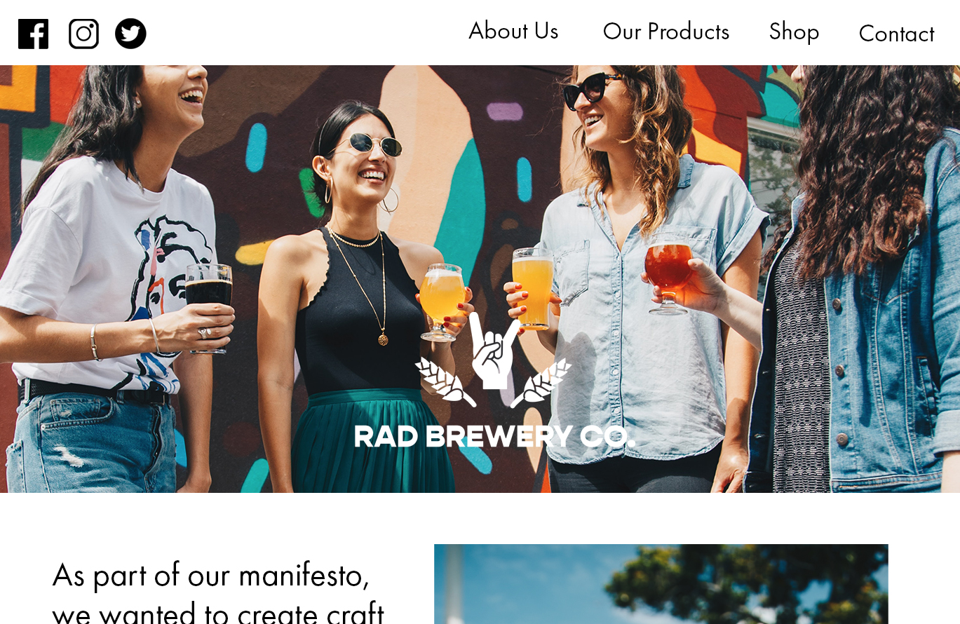
This is a self initiated project where I created a fictional craft beer company called ‘Rad Brewery Co.’. In this project I created a brand concept, logo, illustrated packaging, and webpage mockup.
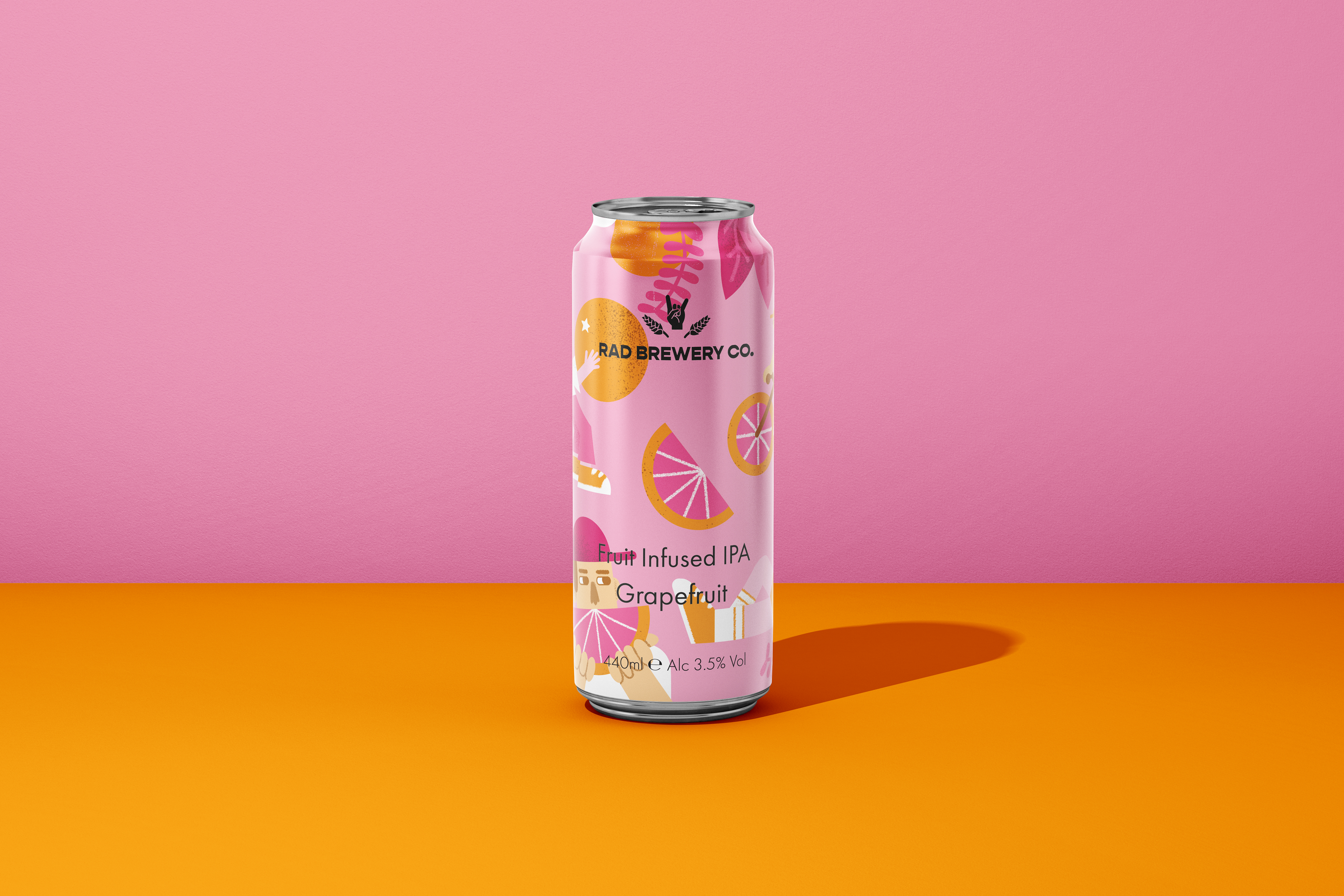
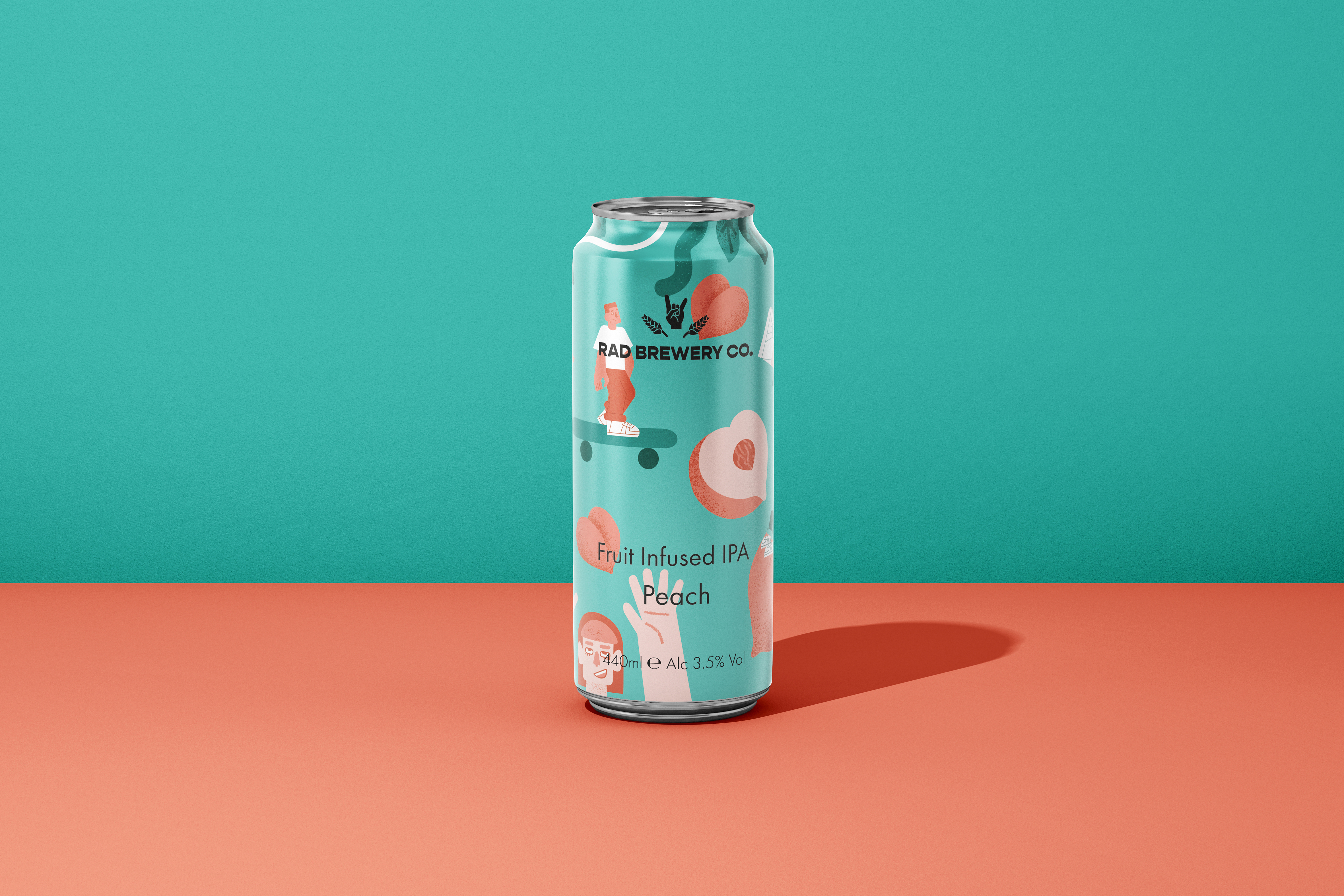
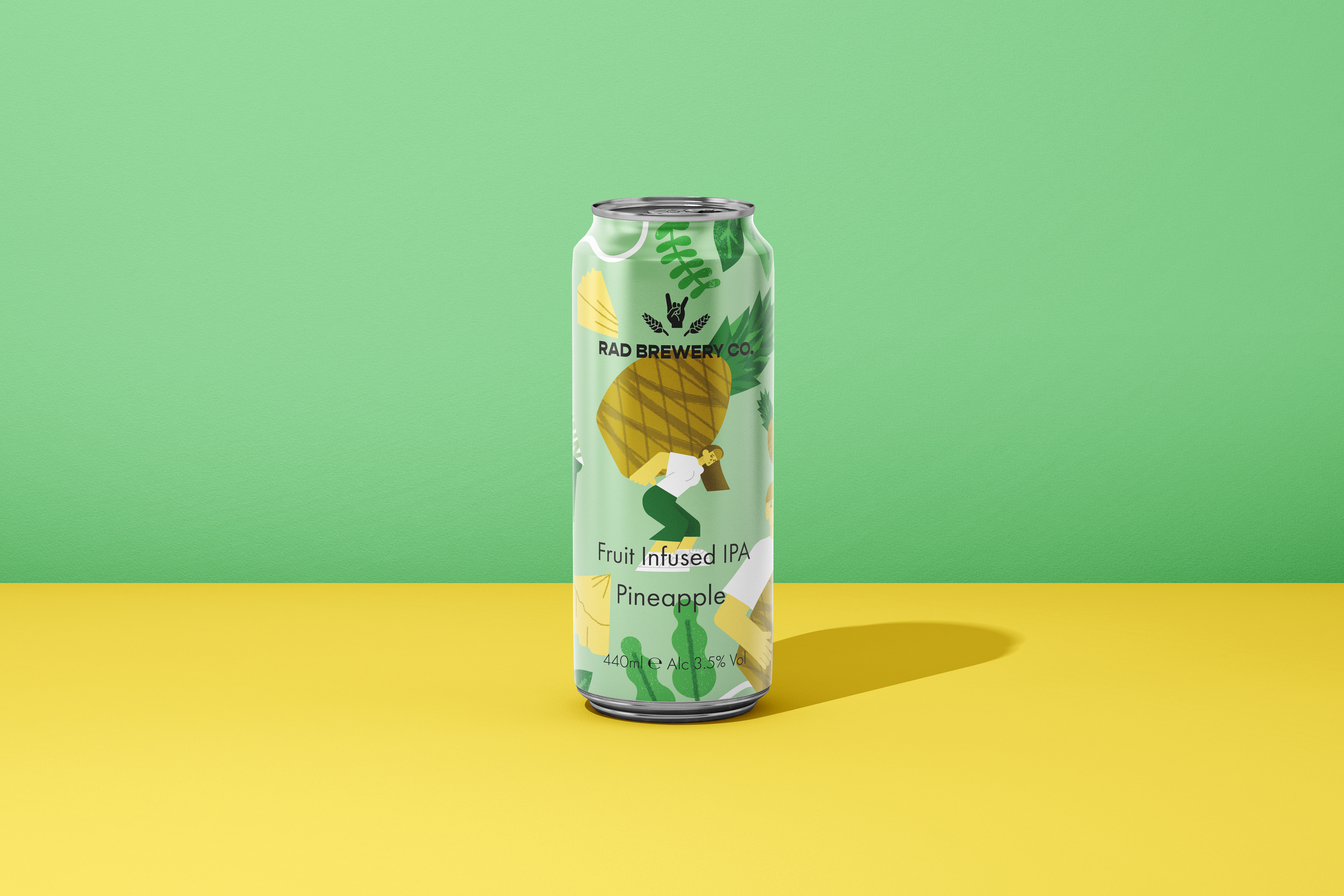
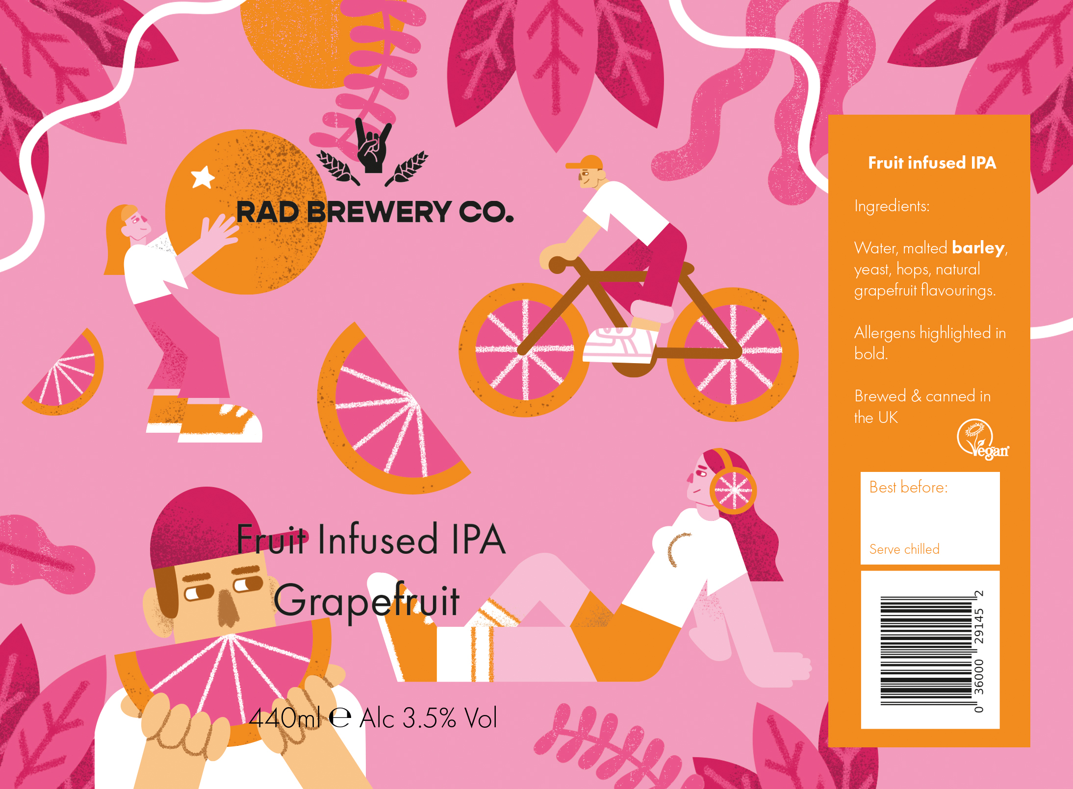
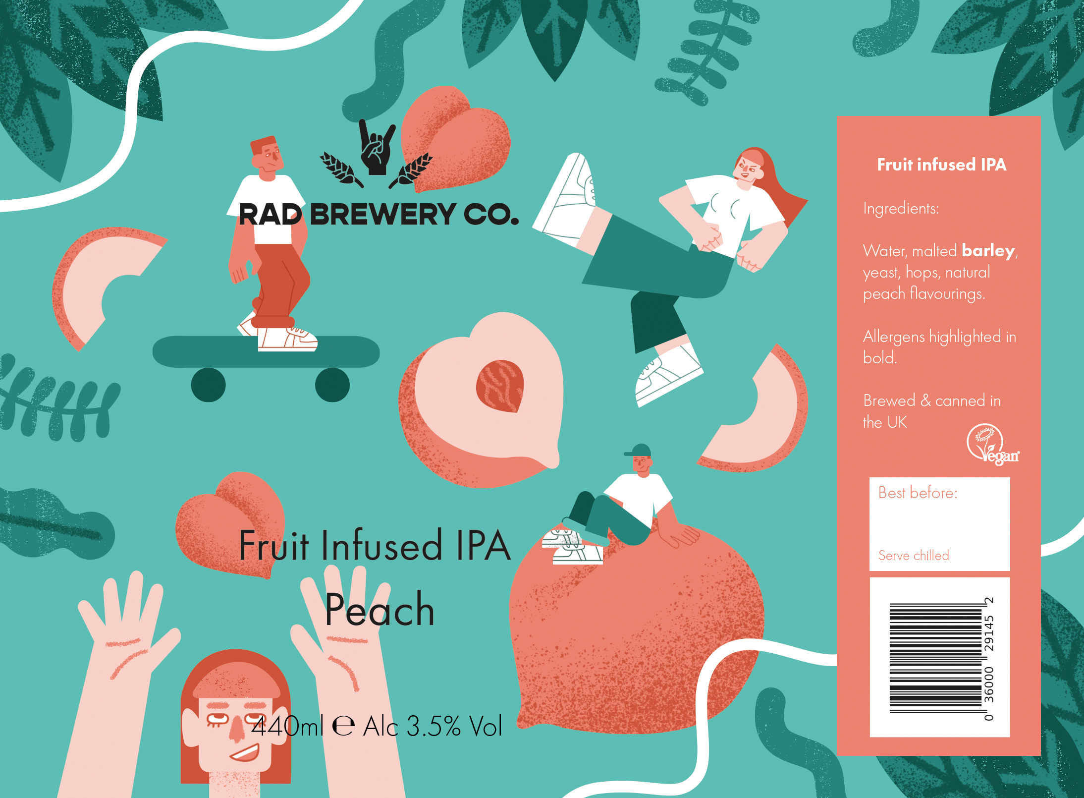
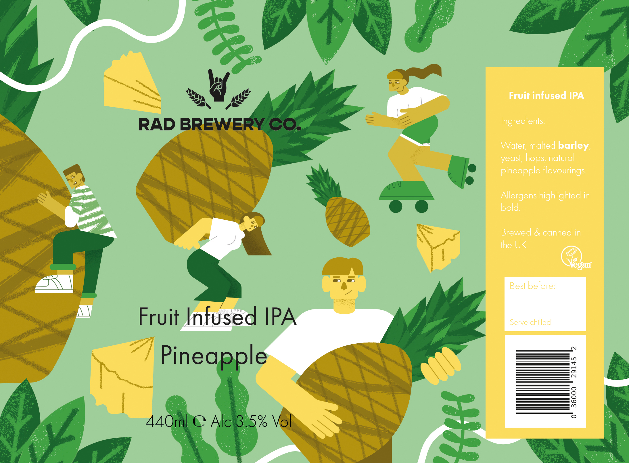
As with my previous project, I wanted to create a fictional company with morals I align with. My idea for the Rad Brewery Co. was to have a craft beer company that was fun and inclusive. The products would be vegan and carbon neutral, and the company would put a share of the profits towards progressive projects.
The product line I illustrated is a series of fruit infused IPAs, a product which I feel is fun and unique. I wanted to avoid using dark or overtly masculine imagery which is often used in other craft beer packaging. Instead I chose to make the products as bright and exciting as possible.
I wanted to focus on more figurative illustrations, as I wanted it to communicate the brand's emphasis on inclusivity and positive social change. To make the labels look fun, I made the characters interact with the fruit in silly, unusual ways, while changing the proportions of the fruit to mimic beach balls.
In terms of the logo, I wanted to use a hand to reflect the human and social values of the company. I tried out a variety of hand gestures, from fists to peace signs. Although the one I chose isn't traditionally the sign associated the with phrase 'radical', I chose it as I felt it was fun, and still communicated the idea of being radical without being too serious or appropriative.
Next ︎︎︎
︎︎︎Back
Home
© Ettie Webb Illustration 2024