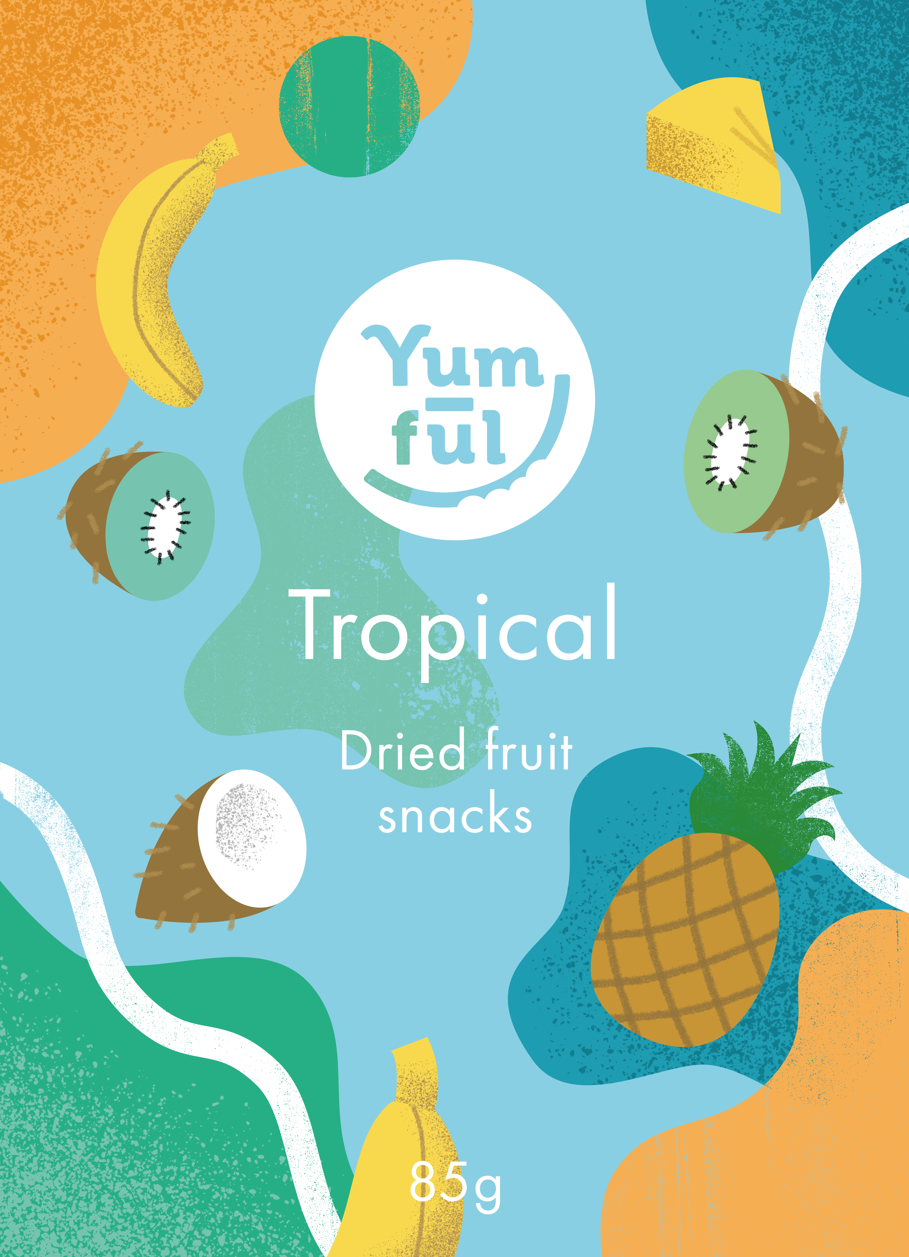
Yumful Snack Branding


For this self initiated project I wanted to design an organic snack brand as well as illustrate some packaging. Originally I considered designing a sweets brand, but I decided to change it to a health food snack instead as I wanted to make a product I would buy myself. The snacks would be made from dried fruit, and would pose as a healthier alternative to sweets. The audience would be everyone, from health conscious parents and their children, to adults who want a sweet treat without the refined sugar. I chose the name ‘Yumful’ as I felt it reflected the values of the product; yummy, fun, and playful, but simple with few ingredients.
In terms of the logo I wanted it to be simple and modern. I knew I wanted the packaging to be very detailed and colourful, and so I wanted the logo to contrast with that and be more legible. Within the logo I played around with some fruit motifs, and in the end chose some teeth marks and leaves to emphasise the product’s values without being too complicated.
I knew the illustrations had to be bold and colourful, and feature the fruit that would be used as the ingredients in the snack. I started off designing the labels with big organic forms and bold colours, and wanted to try and illustrate the packaging in a different style to my normal one to showcase my flexibility. In the end I decided to stick with using my signature style, simply because it felt the most natural for the product. Overall I feel the illustrations and the logo harmonise with one another whilst also articulating the brand’s values well.
Next ︎︎︎
︎︎︎Back
Home
© Ettie Webb Illustration 2024


